Strong Dr. Design Plan
- Beth Fratt

- Jun 17, 2020
- 5 min read
Updated: Jun 19, 2020
As we started the design process for this 1963 ranch, I wanted to stay as true to the soul of the property as possible. We wanted to keep the rest of the “charm” of this place, and there was great debate if we should keep the yellow tub or the blue toilet. In the end, though, as we started to really look around, we knew that once we replaced one piece, it would make the vintage pieces look “outdated” and would make for a patchy design. So we opted to keep the “charm” with updated pieces that would keep the soul of the house.
I started with a color scheme

White Dove by Benjamin Moore
Eider White by Sherwin Williams
Mountain Pine by Behr
Poppy Seed by Behr
One to Remember by Behr
I generally like a lot of color around me and was super inspired by this space.

Honestly, all of Dabito's work is fantastic! If you haven’t already, you should check out his work here.
In the end, though, I knew that this space had to stay pretty neutral as we would be selling it less than a year in. One of my go to “white” paints is Eider White by Sherwin Williams. It is a creamier white that has so much versatility in it. It reads as light and crisp and airy, like most white paints do. But when you pair it with a pure white like Dunn Edwards “white” or White Dove by Benjamin Moore, you can actually see that it is darker. Once I found this "non white" white, I started to use it everywhere. It is the white I used in my dad’s guest room, my daughter’s room at the Novelty house, and now for all the main living spaces in this house.
I used the White Dove for baseboards, and the Dunn Edwards white for the ceilings.
As for the design, we really wanted to stay true to the '63 aesthetic as possible. Here is the floor plan.

The first thing we looked at was walls-what needed to go, what needed to move, and how much would it cost. The obvious walls that needed to be taken out or modified were these two:


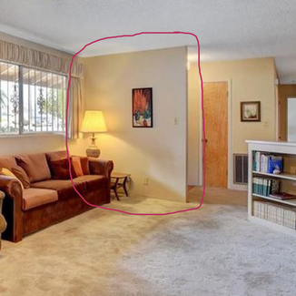


The first wall was not load bearing, but created a cramp space as you entered the house. It was an easy choice to take that one out. In the Kitchen, we wanted to just pull that wall back some more. To open it completely would mean loosing too many cabinets, so we peeled it back enough to still have upper cabinets on the shared garage wall.
The big debate then became whether or not we would take down the middle wall to make all of the living space completely open.


You can see in this other model how taking that wall out really opened the space. In this rehab, they got rid of the kitchen wall all together to create a much bigger kitchen with an island and way more counter space. At the end of the day, a house that is only about 1800 sq feet doesn't really need a kitchen much bigger than what we had. As glamorous as this rehab is, it doesn't really look like a '63 ranch in Las Vegas. To honor the history of this home while updating it, you have to be mindful of what the space can actually do. This is a three bedroom home. Even with five of us living here, we had more than enough room in the kitchen as it was. I also liked that the wall delineated the spaces. So we opted to save the money and keep the wall. We did take out the door between the formal dinning space and the kitchen, though. It was just too cumbersome to keep.
Now that we had a "floor plan" in place, we looked to the actual design.
For the kitchen, I was super inspired by this Jenn Pinkston over at The Effortless Chic.

I liked how modern but classic this looked. Cabinets in the 60's were clean like this, and would either be wood or a bold color. Knowing we were going with IKEA cabinets, I knew I could paint the doors to infuse some color into this otherwise plain color scheme.
The fireplace was a big point of debate.

We definitely didn't want a full wall of brick here. But as we examined the wall, we found out that the brick had been extended. If you look at where the plant in, there is a curve in the wall that you can't see in the picture. This is where they extended the brick. You can tell because there are black and grey bricks in that area that aren't in the rest of the wall. When they added the brick, they did not apply it well or reinforce the wall they were applying it to. No matter what, we had to take down most the brick because it was starting to pull on the drywall. We opted to take off what was added, and bring it down about half way so that you could enjoy the fireplace, but it wouldn't be the main focal point. Now, to paint or not to paint?
The wallpaper was an absolute "keep" for the integrity of this house.

We even covered it up for protection! But as everything around it was made new and fresh, this looked dated and worn. The seems that are visible in the pictures were just so much worse in person. At the end of the day, we had to take it down, but we kept the chandelier in place.
Next up were the bathrooms. We talked a lot about not touching these at all. In the Guest Bath, the shower head wasn't even high enough for my 5'3" daughter to fit under, and the cabinet was so worn out. Changing one thing would lead to another, so we decided to scrap the whole thing and start over. The same issue came up in the Primary Bath. That blue toilet was worth keeping, but the tiny shower space with the matching blue tile was just too small. So, again, we started over there.
I was super inspired by both of these bathrooms


There was a case to be made for going super retro and super whimsical. In the end, we did a high and low end bath. You can see which one was my favorite here.
The bedrooms will all get new paint and new lighting. The popcorn ceiling will be removed throughout. We are planning on doing concrete floors. And all of it will be done in just 8 short weeks! Right?!
Right.


Comments